The study and ongoing research focusing on new decorative effects (which we rigorously conduct in our own in-house laboratory) are likewise rooted in this “exchange relationship”. As a result, we are able to:
• create products of considerable aesthetic value that are also high-performing.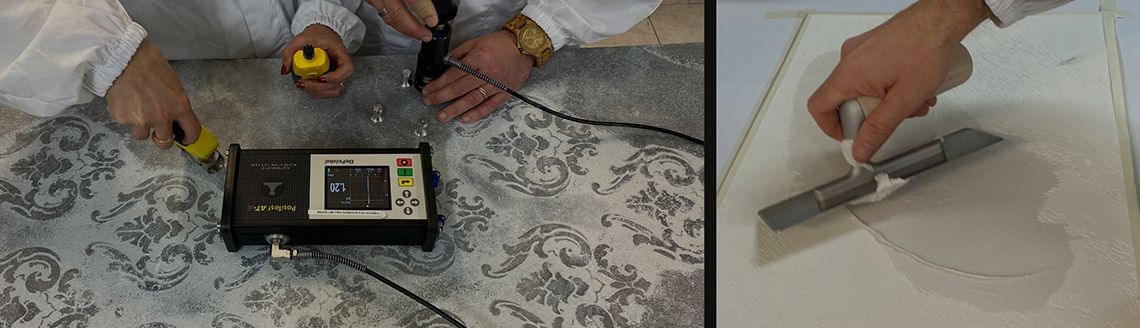
• provide designers with support in taking aesthetic but also technical decisions.
• make available to designers solutions that allow for studying all aspects of an interior design project.
We believe that decorative paints, thanks to their chromatic and material properties, are able to characterise environments by endowing them with a personal touch and an original design. Especially when we use sophisticated decorative effects, we can often highlight certain details or specific zones on which we want to direct the observer’s attention.
By using decorative paints with a high aesthetic impact, the designer can incorporate in the interior design project certain details or elements that need to be enhanced, by emphasising them through special textures and nuances, which turn
into actual furnishing accessories.
This gives rise to some interesting projects, capable of simultaneously enhancing the design and application through the use of VALPAINT decorative paints.
Today we want to introduce you to one of them: the revisitation of the interior design of the COAL GROUP head office. We discussed the project with the client’s architect who studied the decoration of certain surfaces with the use of VALPAINT products.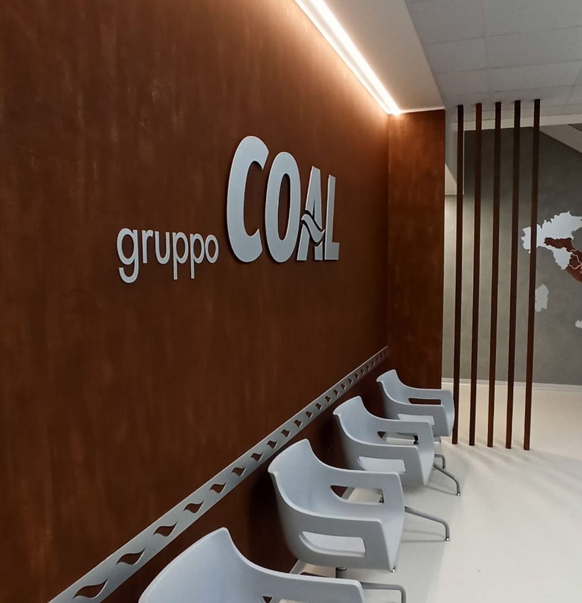
KLONDIKE CORTEN and KLONDIKE LIGHT: the VALPAINT decorative paints underlying the Coal Group project
The COAL GROUP is based in the province of Ancona and specialises in large-scale distribution throughout Central Italy with several brands.
The project was aimed at revamping and emphasising certain areas by enhancing them and transforming them into actual visual references.
The designer-architect chose, also with the aid of VALPAINT technicians, two decorative effects with a decidedly contemporary dimension: KLONDIKE CORTEN and KLONDIKE LIGHT.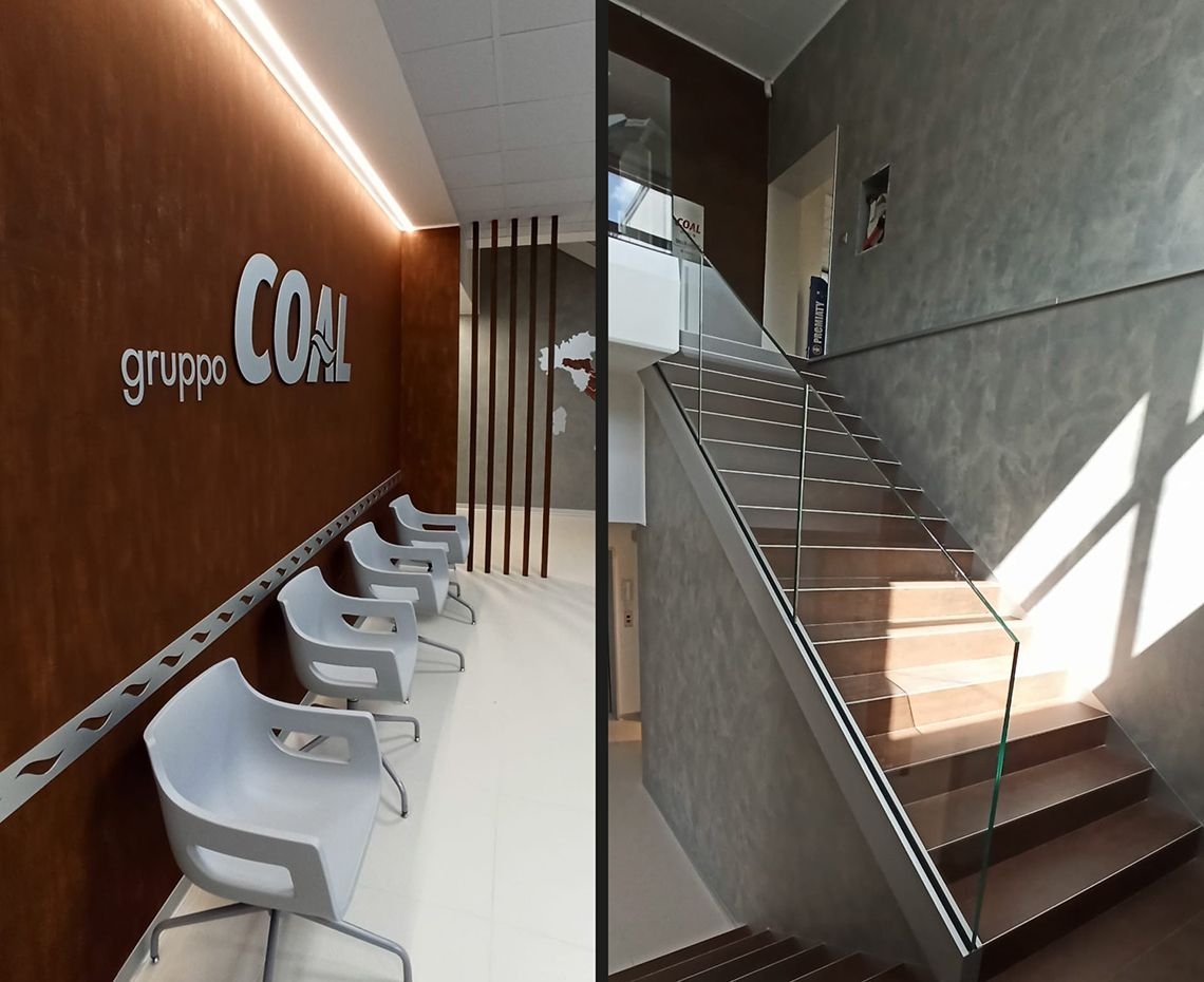
KLONDIKE CORTEN: using corten-effect paint
KLONDIKE CORTEN is a decorative paint that reproduces the rusted-iron (corten or weathering steel) effect with its distinctive streaks which form when dripping water leaves rust marks over the years.
This decorative product was created for being used on outdoor surfaces but it works just as well in interiors. The product can be applied in two different ways:
• a dripped version which enhances the typical dripping marks of rusted iron;
• a polished-plaster version which leaves the surface looking uniform and regular.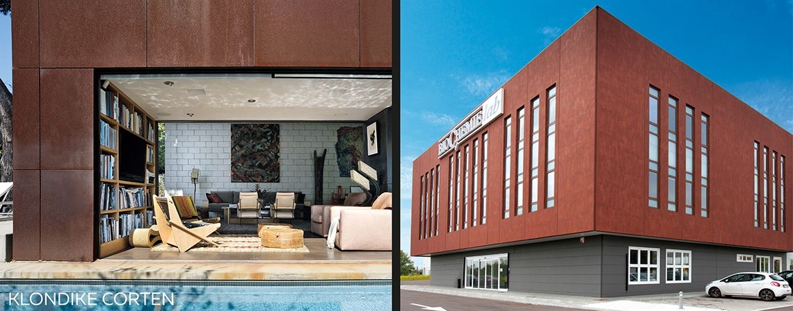
KLONDIKE LIGHT: metal-effect paint
KLONDIKE LIGHT is a product for interiors which, thanks to its special properties, enhances certain metallic shades that define modern and contemporary surfaces. Extremely easy to work, the product comes in many different nuances and, when used with special additives, enhances golden and silvery shades.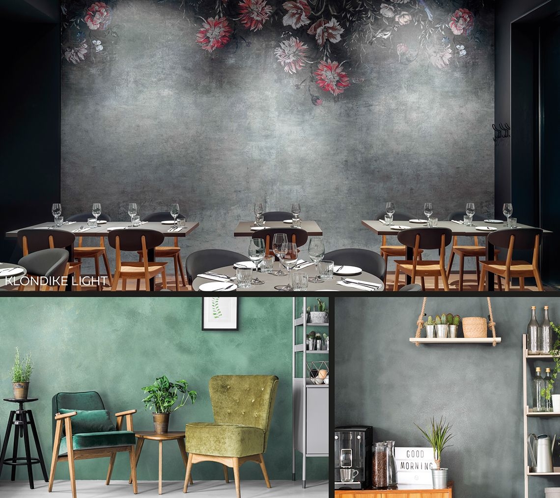
The project and extra quality of VALPAINT decorative paints for walls
Both the decorative paints for walls used in this project rank among the finishes that best reflect a metropolitan, urban and, at times, industrial style.
As for the Coal Group offices, the KLONDIKE CORTEN paint for special interiors (Ref. 106 Klondike Corten Catalogue) was applied to the large wall at the entrance to the group’s representative office.
This wall (which ends with a wing, made up of slim columns) forms the backdrop for the group’s logo. The solution adopted, thanks to the special nuances that it recreates, enhances both furnishing elements and commands the attention of the observer entering the hall.
The same material was also used to indicate and highlight the company’s branches on a map of Italy, adding a charming additional touch.
The KLONDIKE LIGHT modern decorative paint was instead chosen to brighten up the walls enclosing the stairway leading up to the second floor, thanks to its light grey shade and its special metallic reflections.
The colour clash between the two materials, optimally mixed together, yielded an environment that is immaculate yet filled with details and always distinctly up-to-date.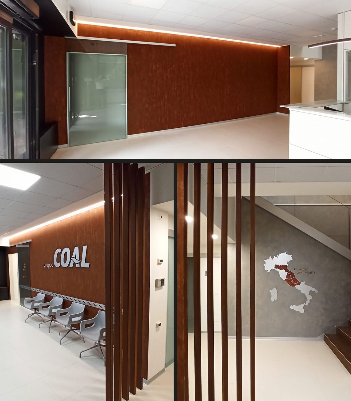


 Bulgaro
 Cinese
 Coreano
 Croato
 Francese
 Greek
Greek Inglese
 Italiano
 Japanese
 Lituano
 Polacco
 Portoghese
 Russo
Russo Spagnolo
 Tedesco